Layover
Layover
Layover
Layover
Convert Thrifty Travelers to Avid Shoppers, With Airport Price Matching
Convert Thrifty Travelers to Avid Shoppers, With Airport Price Matching
Convert Thrifty Travelers to Avid Shoppers, With Airport Price Matching
Find cheaper deals that will boost overall sales from a perviously underserved user base.
Find cheaper deals that will boost overall sales from a perviously underserved user base.
My Role
UX/UI Designer, UX Researcher
Date
December 2024 - February 2025
Category
Mobile App
My Role
UX/UI Designer, UX Researcher
Catagory
Mobile App
Date
December 2024 - February 2025
My Role
UX/UI Designer, UX Researcher
Date
December 2024 - February 2025
Category
Mobile App


Why The Airport Needs A Retail
Food Delivery App
Why The Airport Needs A Retail Food Delivery App
Have you ever been on a long flight, arriving at your destination tired, hungry, and exhausted? Well for those who are on a limited budget with little down time, it can be a nightmare to find the right shop to settle down and eat.
"I look for anything that’s filling, like pasta so it's my only meal of the day."
"Mom does not want to leave the gate and she wants fast food so we can go back and sit."
These were a few quotes I picked up from my user interviews and there are plenty more. Not only is this a problem for the people, but expensive food and long wait times can discourage travelers from spending, thus decreasing revenue for the airport itself.

What I Did To Make Things Better
What I Did To Make Things Better
A Boarding Pass + Food Delivery App
A Boarding Pass + Food Delivery App
A Boarding Pass + Food Delivery App
✈️🏢 +📱🚴♀️🍔
✈️🏢 +📱🚴♀️🍔
✈️🏢 +📱🚴♀️🍔
This app will cut down on wait times and help travelers stay on top of their flight schedules, while helping users make better food related budget choices.
This app will cut down on wait times and help travelers stay on top of their flight schedules, while helping users make better food related budget choices.
This app will cut down on wait times and help travelers stay on top of their flight schedules, while helping users make better food related budget choices.


So How Bad Is The Airport?
So How Bad Is The Airport?
So How Bad Is The Airport?
To understand my audience, I decided to do some research into the problem. In this study, I gathered a group of of 5 people between the ages of 20-40 and asked them about their experiences in the airport through one on one remote calls.
To understand my audience, I decided to do some research into the problem. In this study, I gathered a group of of 5 people between the ages of 20-40 and asked them about their experiences in the airport through one on one remote calls.
To understand my audience, I decided to do some research into the problem. In this study, I gathered a group of of 5 people between the ages of 20-40 and asked them about their experiences in the airport through one on one remote calls.
A Very Stressful Set Of Patterns Started To Emerge From My Annotations Below
A Very Stressful Set Of Patterns Started To Emerge From My Annotations Below
A Very Stressful Set Of Patterns Started To Emerge From My Annotations Below

80% expressed:
Fear & Urgency
Users who wait for flights said they were often anxious and stayed near their gates or ordered fast food to save time.
80% expressed:
Fear & Urgency
Users who wait for flights said they were often anxious and stayed near their gates or ordered fast food to save time.
80% expressed:
Fear & Urgency
Users who wait for flights said they were often anxious and stayed near their gates or ordered fast food to save time.
100% hesitated in:
Spending Money
Complaints of expensive shops in the airport lead many to forgo spending, or spending as little as possible.
100% hesitated in:
Spending Money
Complaints of expensive shops in the airport lead many to forgo spending, or spending as little as possible.
100% hesitated in:
Spending Money
Complaints of expensive shops in the airport lead many to forgo spending, or spending as little as possible.
100% spoke up about:
Airport Food
From expensive food prices, to food safety, and tactics to get the cheapest and most filling food, people had a lot to say.
100% spoke up about:
Airport Food
From expensive food prices, to food safety, and tactics to get the cheapest and most filling food, people had a lot to say.
100% spoke up about:
Airport Food
From expensive food prices, to food safety, and tactics to get the cheapest and most filling food, people had a lot to say.
100% expressed:
Stressful Tasks
Going through TSA, to navigating the airport, every user expressed some degrees of frustration with the process.
100% expressed:
Stressful Tasks
Going through TSA, to navigating the airport, every user expressed some degrees of frustration with the process.
100% expressed:
Stressful Tasks
Going through TSA, to navigating the airport, every user expressed some degrees of frustration with the process.
The Stressors Of The Airport
The Stressors Of The Airport
The Stressors Of The Airport
80% expressed:
Fear & Urgency
Some users were anxious about missing their flights and often waited at their gate.
100% hesitated in:
Spending Money
Complaints of expensive shops in the airport lead to spending as little as possible.
100% spoke up about:
Airport Food
Being too expensive, to being concerned about food quality.
100% expressed:
Stressful Tasks
Navigating the airport, TSA and so on were a huge burden for many.
Findings Further Analyzed:
Findings Further Analyzed:
Findings Further Analyzed:
Airport Food: Some users ate fast food because sit down restaurants took too long to serve them.
Stressful Airport Tasks: 40% of users interviewed said they were overwhelmed by the amount of tasks and people in the airport to remain at ease.
Airport Food: Some users ate fast food because sit down restaurants took too long to serve them.
Stressful Airport Tasks: 40% of users interviewed said they were overwhelmed by the amount of tasks and people in the airport to remain at ease.
Who Is Struggling?
Who Is Struggling?
Who Is Struggling?

The Frequent Traveler
The Frequent Traveler
The Frequent Traveler

The Casual Traveler
The Casual Traveler
The Casual Traveler
Does A Similar App Already Exist?
Does A Similar App Already Exist?
Does A Similar App Already Exist?
I Searched Competitors To See If Creating Something Like This Was Viable:
I Searched Competitors To See If Creating Something Like This Was Viable:
I Searched Competitors To See If Creating Something Like This Was Viable:


What Were They Doing Competitive Wise?
What Were They Doing Competitive Wise?
What Were They Doing Competitive Wise?

Competitive Analysis
Competitive Analysis
Competitive Analysis
Key Findings
All competitors had some type of store carousel or layout that allowed users to tap in to see their basic information such as menus, location, estimated times, delivery, or pickup options in some form.
Door dash was the most advanced out of all these apps and provided extra services such as recommendations for extra orders.
Aside from B4, all other services had some form of order ahead feature that allowed users to place orders either ahead of time or hold orders.
Now to Define The Problem:
Now to Define The Problem:
Now to Define The Problem:
Anxieties Over Time & Missed Flights
Anxieties Over Time & Missed Flights
Users have expressed their desire to catch their flights on time and are unwilling to comprise on longer wait times, leading to potential loss of business for vendors in the airport
Users have expressed their desire to catch their flights on time and are unwilling to comprise on longer wait times, leading to potential loss of business for vendors in the airport
Users have expressed their desire to catch their flights on time and are unwilling to comprise on longer wait times, leading to potential loss of business for vendors in the airport
An Expensive Place To Be
An Expensive Place To Be
Evidence has shown of users saying things are too expensive in the airport, so they are less willing to spend.
Evidence has shown of users saying things are too expensive in the airport, so they are less willing to spend.
Evidence has shown of users saying things are too expensive in the airport, so they are less willing to spend.
Losing Potential Customers
Losing Potential Customers
Losing Potential Customers
From the airport's perspective, things are just as bad because they are losing potential customers that could have generated revenue and increased profits.
From the airport's perspective, things are just as bad because they are losing potential customers that could have generated revenue and increased profits.
From the airport's perspective, things are just as bad because they are losing potential customers that could have generated revenue and increased profits.
Then Sketch A Concept
Then Sketch A Concept
Then Sketch A Concept
The Sketch Was A Hybrid Boarding Pass + Food Delivery App To Help Users Save Money And Time When Traveling
The Sketch Was A Hybrid Boarding Pass + Food Delivery App To Help Users Save Money And Time When Traveling
The Sketch Was A Hybrid Boarding Pass + Food Delivery App To Help Users Save Money And Time When Traveling

Low Fidelity Sketches
Low Fidelity Sketches
Low Fidelity Sketches
Then Build The Architecture
Then Build The Architecture
Then Build The Architecture
Building Out A Skeleton Of The App, I Tried To Find A Good Place For The Future Check Out Process
Building Out A Skeleton Of The App, I Tried To Find A Good Place For The Future Check Out Process
Building Out A Skeleton Of The App, I Tried To Find A Good Place For The Future Check Out Process

Site Map of Layover App
Site Map of Layover App
Site Map of Layover App
These Task Flows Explain The Food Ordering And Delivery Preferences In Detail
These Task Flows Explain The Food Ordering And Delivery Preferences In Detail
These Task Flows Explain The Food Ordering And Delivery Preferences In Detail

How to Order Food, Search for Restaurant, and Delivery Preferences
How to Order Food, Search for Restaurant,
and Delivery Preferences
How to Order Food, Search for Restaurant, and Delivery Preferences
The Mid Fidelity
The Mid Fidelity
The Mid Fidelity
Changes From Low to Mid Fidelity
Changes From Low to Mid Fidelity
Changes From Low to Mid Fidelity
Adding An "Order Ahead" Feature
Found in the competitive analysis, this feature will allow users to not only be able to order in their current airports, but to the next airport they will be landing at to shave off those precious extra minutes.
Order Ahead Will Bring In Extra Revenue
Adding An "Order Ahead" Feature
Found in the competitive analysis, this feature will allow users to not only be able to order in their current airports, but to the next airport they will be landing at to shave off those precious extra minutes.
Order Ahead Will Bring In Extra Revenue
Adding An "Order Ahead" Feature
Found in the competitive analysis, this feature will allow users to not only be able to order in their current airports, but to the next airport they will be landing at to shave off those precious extra minutes.
Order Ahead Will Bring In Extra Revenue
Adding An "Order Ahead" Feature
Found in the competitive analysis, this feature will allow users to not only be able to order in their current airports, but to the next airport they will be landing at to shave off those precious extra minutes.
Order Ahead Will Bring In Extra Revenue
The Mid Fidelity Has 3 Different Task Flows:
The Mid Fidelity Has 3 Different Task Flows:
The Mid Fidelity Has 3 Different Task Flows:
Part 1: Placing An Order At The Airport And Delivery
The first flow is how to place an order in the user's current airport. Early concept of a boarding pass feature and a purchase flow can be seen here.
Part 1: Placing An Order At The Airport And Delivery
The first flow is how to place an order in the user's current airport. Early concept of a boarding pass feature and a purchase flow can be seen here.
Part 1: Placing An Order At The Airport And Delivery
The first flow is how to place an order in the user's current airport. Early concept of a boarding pass feature and a purchase flow can be seen here.
Mid Fidelity Part 1 (IAD Placing a Delivery Order)
Mid Fidelity Part 1 (IAD Placing a Delivery Order)
Mid Fidelity Part 1 (IAD Placing a Delivery Order)
Part 2: Selecting Order Ahead Location At The Next Airport
Part 2: Selecting Order Ahead Location At The Next Airport
Part 2: Selecting Order Ahead Location At The Next Airport

Mid Fidelity Part 2 (Select an Location in LAX)
Mid Fidelity Part 2 (Select an Location in LAX)
Mid Fidelity Part 2 (Select an Location in LAX)
Part 3: Ordering Ahead Even Before The User Arrives At Their Next Airport
Part 3: Ordering Ahead Even Before The User Arrives At Their Next Airport
Part 3: Ordering Ahead Even Before The User Arrives At Their Next Airport
Mid Fidelity Part 3 (LAX Place Order Ahead)
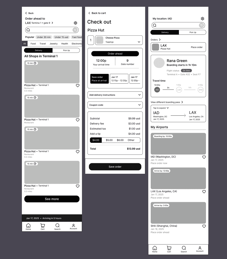
Mid Fidelity Part 3 (LAX Place Order Ahead)
Mid Fidelity Part 3 (LAX Place Order Ahead)
The Mid Fidelity Was Tested With 5 More Users, Here Are The Results:
The Mid Fidelity Was Tested With 5 More Users, Here Are The Results:
The Mid Fidelity Was Tested With 5 More Users, Here Are The Results:
80% did not understand:
The Save Order Feature
Users had trouble explaining what the "Save Order" feature meant and were split into two camps.
40% Requested:
Automatic Order Feature
After seeing the "Save Order" feature in the "Order Ahead" flow, 40% of users wanted orders to be placed automatically.
80% did not know:
Where to Find the Shops
Users were confused by the Dashboard and couldn't figure out where to click.
80% did not know:
Where to Find the Shops
Users were confused by the Dashboard and couldn't figure out where to click.
80% did not know:
Where to Find the Shops
Users were confused by the Dashboard and couldn't figure out where to click.
40% did not like the:
Confusing Dashboard
Users said the Dashboard appeared more like a boarding pass app than a food delivery app.
40% did not like the:
Confusing Dashboard
Users said the Dashboard appeared more like a boarding pass app than a food delivery app.
40% did not like the:
Confusing Dashboard
Users said the Dashboard appeared more like a boarding pass app than a food delivery app.
80% did not know:
Where to Find the Shops
Users were confused by the Dashboard and couldn't figure out where to click.
40% did not like the:
Confusing Dashboard
Users said the Dashboard appeared more like a boarding pass than a food delivery app.
80% did not understand:
The Save Order Feature
Users had trouble explaining what the "Save Order" feature meant and were split into two camps.
80% did not understand:
The Save Order Feature
Users had trouble explaining what the "Save Order" feature meant and were split into two camps.
80% did not understand:
The Save Order Feature
Users had trouble explaining what the "Save Order" feature meant and were split into two camps.
40% Requested:
Automatic Order Feature
After seeing "Save Order" feature in the "Order Ahead" flow, 40% of users wanted orders to be placed automatically.
40% Requested:
Automatic Order Feature
After seeing "Save Order" feature in the "Order Ahead" flow, 40% of users wanted orders to be placed automatically.
40% Requested:
Automatic Order Feature
After seeing "Save Order" feature in the "Order Ahead" flow, 40% of users wanted orders to be placed automatically.
Analysis
From testing, the Dashboard and the Check Out page that houses the "Order Ahead" were the most confusing because the UI felt too much like a boarding pass app.
Since there was no app on the market as of writing that has these two mental modals merged (Food Delivery & Boarding Pass), I could only relay on my data and sketches to come up with a viable solution.
Hello World, Hello Layover!
Hello World, Hello Layover!
Hello World, Hello Layover!
Introducing Layover, The World's First Boarding Pass + Food Delivery App
Layover's UI was focused on simple colors and strong visuals. I specifically studied the appearances of other apps such as Doordash and Uber Eats, being inspired by their visual language.
Introducing Layover, The World's First Boarding Pass + Food Delivery App
Layover's UI was focused on simple colors and strong visuals. I specifically studied the appearances of other apps such as Doordash and Uber Eats, being inspired by their visual language.
Introducing Layover, The World's First Boarding Pass + Food Delivery App
Layover's UI was focused on simple colors and strong visuals. I specifically studied the appearances of other apps such as Doordash and Uber Eats, being inspired by their visual language.
The Logo Is A Combination Between A Plane's Wing And A Price Tag
The Logo Is A Combination Between A Plane's Wing And A Price Tag
The Logo Is A Combination Between A Plane's Wing And A Price Tag

Layover Brand Logo
Layover Brand Logo
Layover Brand Logo
UI Kit Featuring Buttons & Other Elements
UI Kit Featuring Buttons & Other Elements
UI Kit Featuring Buttons & Other Elements

Layover UI Kit
Layover UI Kit
Layover UI Kit
Layover's High Fidelity:
Layover's High Fidelity:
Layover's High Fidelity:
Improving Issues From the Mid Fidelity
The Dashboard Was Redesigned To Reflect The Hybrid App Aspect
I Removed The Choose Your Location Task Flow, Because We Can Use Boarding Pass Information
Improving Issues From the Mid Fidelity
The Dashboard Was Redesigned To Reflect The Hybrid App Aspect
I Removed The Choose Your Location Task Flow, Because We Can Use Boarding Pass Information
Improving Issues From the Mid Fidelity
The Dashboard Was Redesigned To Reflect The Hybrid App Aspect
I Removed The Choose Your Location Task Flow, Because We Can Use Boarding Pass Information

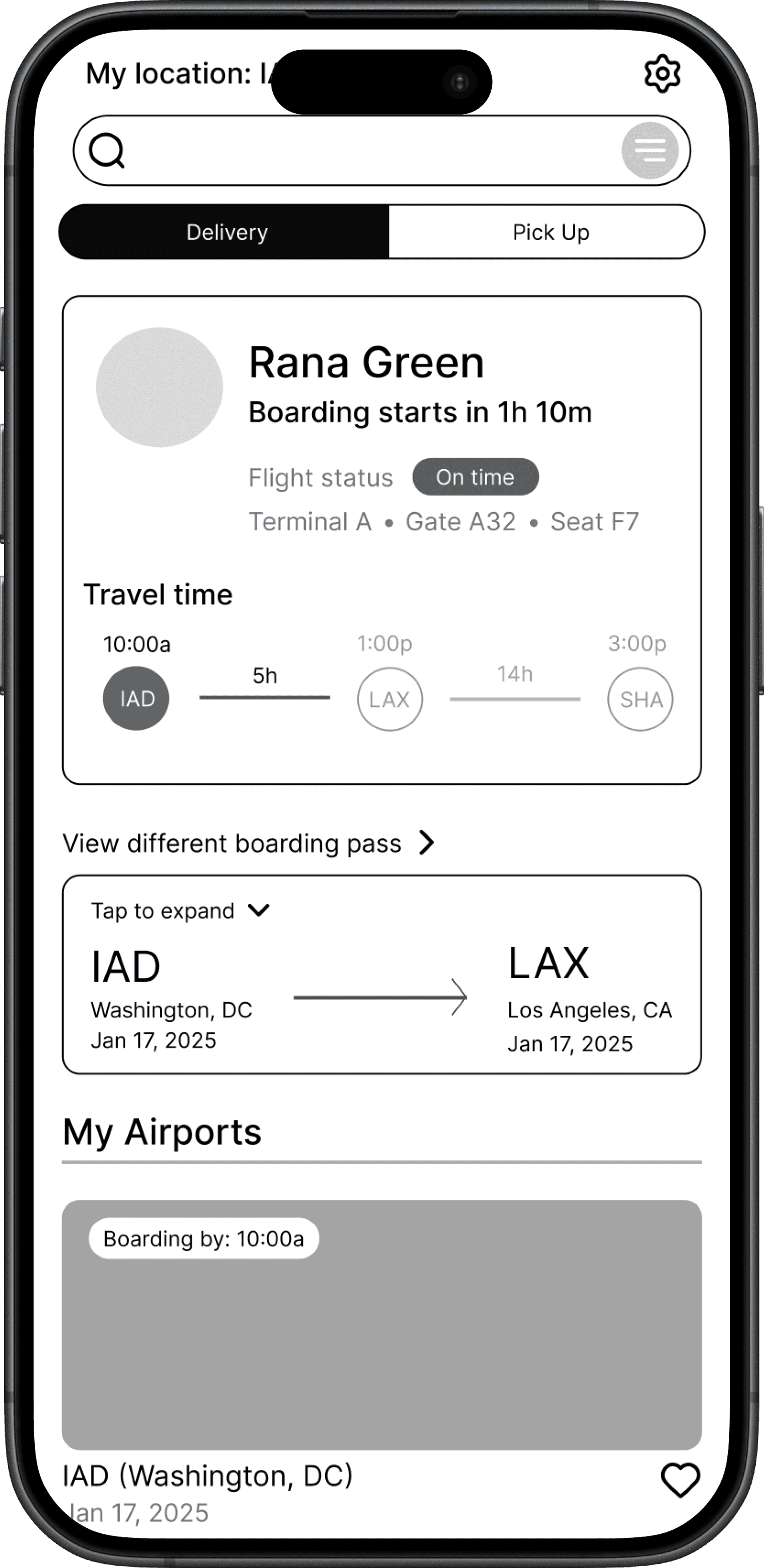
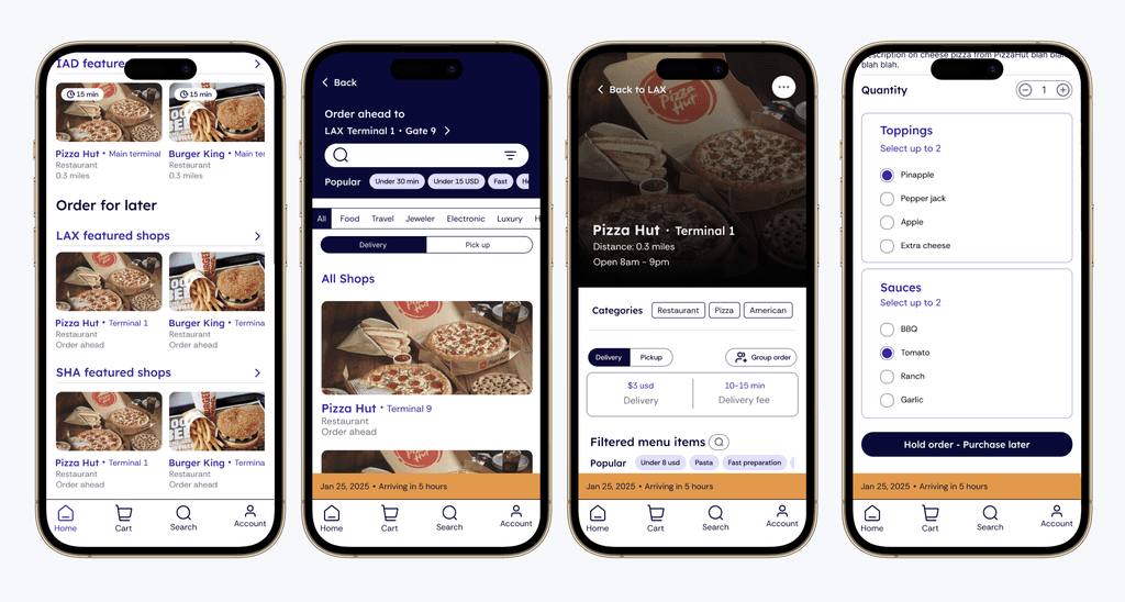
IAD Order Food: New Hybrid Dashboard
IAD Order Food: Part 1
IAD Order Food: Part 1
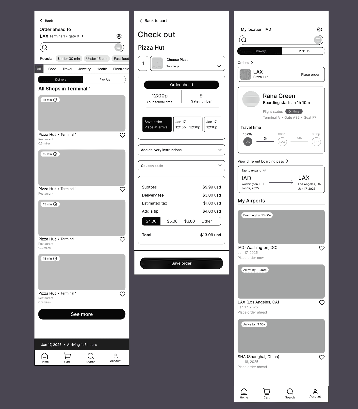
LAX Save Order Feature Has Been Changed To "Hold Order" To Better Reflect The Action Being Taken By The User
LAX Save Order Feature Has Been Changed To "Hold Order" To Better Reflect The Action Being Taken By The User
LAX Save Order Feature Has Been Changed To "Hold Order" To Better Reflect The Action Being Taken By The User

LAX Order Ahead: Part 1
LAX Order Ahead: Part 1
LAX Order Ahead: Part 1

LAX Order Ahead: Part 2
LAX Order Ahead: Part 2
LAX Order Ahead: Part 2
Testing The Designs
Testing The Designs
Testing The Designs
5 More Users Were Asked To Go Through The High Fidelity, Here Are the Results:
5 More Users Were Asked To Go Through The High Fidelity, Here Are the Results:
5 More Users Were Asked To Go Through The High Fidelity, Here Are the Results:
40% Requested:
Better Colors
The blue was used too often, leading to confusion if certain areas were intractable.
40% Requested:
Moving the Coupon Section
The coupon section should be grouped with the other finance options.
40% Requested:
Better Colors
The same main blue was used too often, leading to confusion if certain areas were intractable.
40% Requested:
Better Colors
The same main blue was used too often, leading to confusion if certain areas were intractable.
40% Requested:
Better Colors
The same main blue was used too often, leading to confusion if certain areas were intractable.
40% Requested:
Moving the Coupon Section
The coupon section at the bottom of the Check Out page should be grouped with the other finance options.
40% Requested:
Moving the Coupon Section
The coupon section at the bottom of the Check Out page should be grouped with the other finance options.
40% Requested:
Moving the Coupon Section
The coupon section at the bottom of the Check Out page should be grouped with the other finance options.
60% Were Unsure if:
Their Order Went Through
At the end of the "Order Ahead" flow, users were unsure if their order was placed.
60% Were Unsure if:
Their Order Went Through
At the end of the "Order Ahead" flow, users were unsure if their order was placed.
60% Were Unsure if:
Their Order Went Through
At the end of the "Order Ahead" flow, users were unsure if their order was placed.
40% Were Unsure if:
They Were Charged
Users complained that the "Order Ahead" process did not assure them if their card was charged or not.
40% Were Unsure if:
They Were Charged
Users complained that the "Order Ahead" process did not assure them if their card was charged or not.
40% Were Unsure if:
They Were Charged
Users complained that the "Order Ahead" process did not assure them if their card was charged or not.
60% Were Unsure if:
Their Order Went Through
At the end of the "Order Ahead" flow, users were unsure if their order was placed.
40% Were Unsure if:
They Were Charged
The "Order Ahead" process did not assure user if their card was charged.
Major Rework Of The "Hold Order" Feature
4/5 of users understood what hold order meant, yet 2 users had questions about when this feature would charge their credit cards.
1 user also related the “Hold order” feature to a wishlist, which was an important discovery for my next steps.
Major Rework of the "Hold Order" Feature
4/5 of users understood what hold order meant, yet 2 users had questions about when this feature would charge their credit cards.
1 user also related the “Hold order” feature to a wishlist, which was an important discovery for my next steps.
Major Rework of the "Hold Order" Feature
4/5 of users understood what hold order meant, yet 2 users had questions about when this feature would charge their credit cards.
1 user also related the “Hold order” feature to a wishlist, which was an important discovery for my next steps.
Changes to High Fidelity Based On Tests:
Colors Were Improved, Becoming More Saturated & Coupon Section Was Moved Upwards
Changes to High Fidelity Based On Tests:
Colors Were Improved, Becoming More Saturated & Coupon Section Was Moved Upwards
Changes to High Fidelity Based On Tests:
Colors Were Improved, Becoming More Saturated & Coupon Section Was Moved Upwards

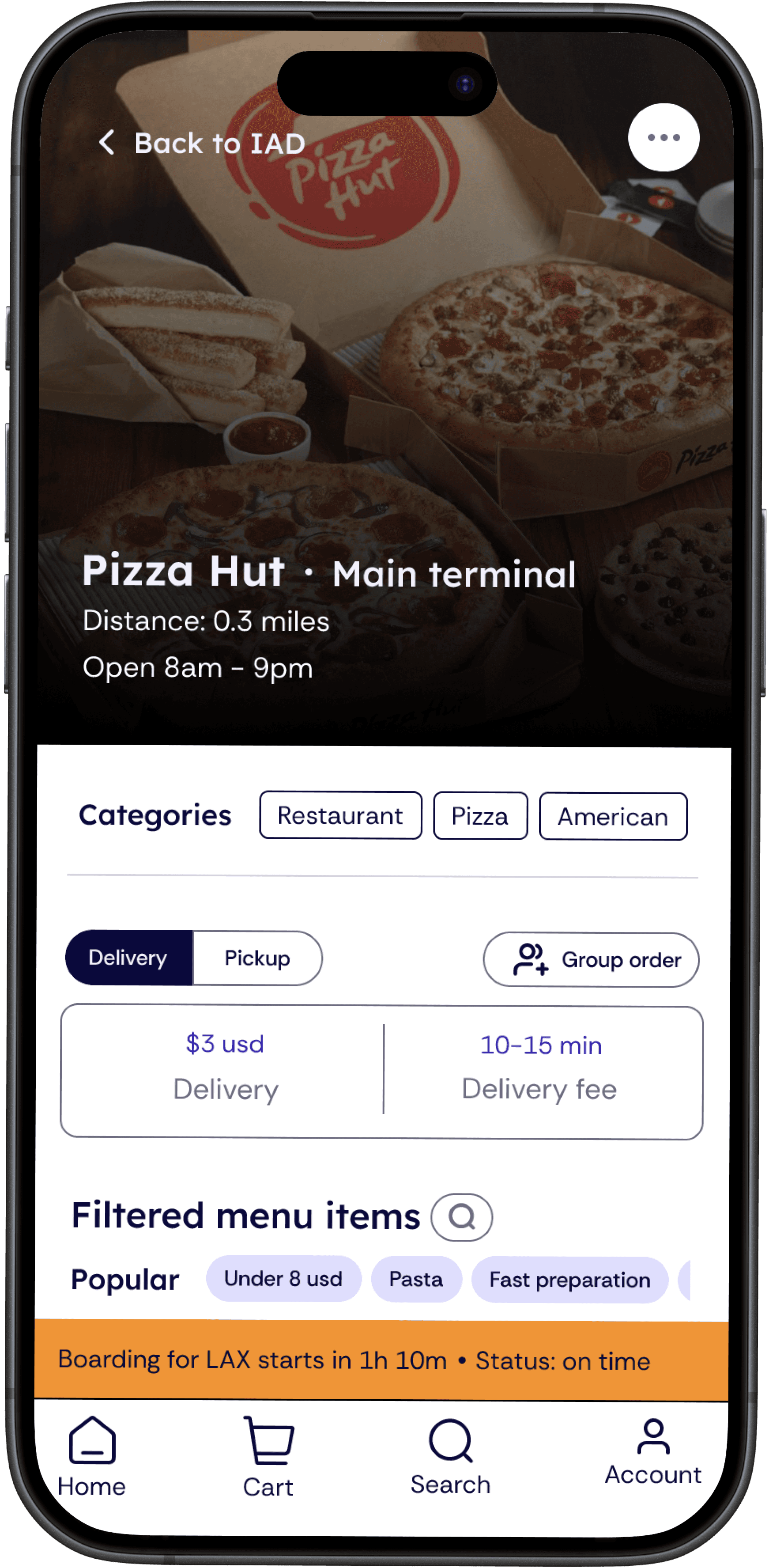
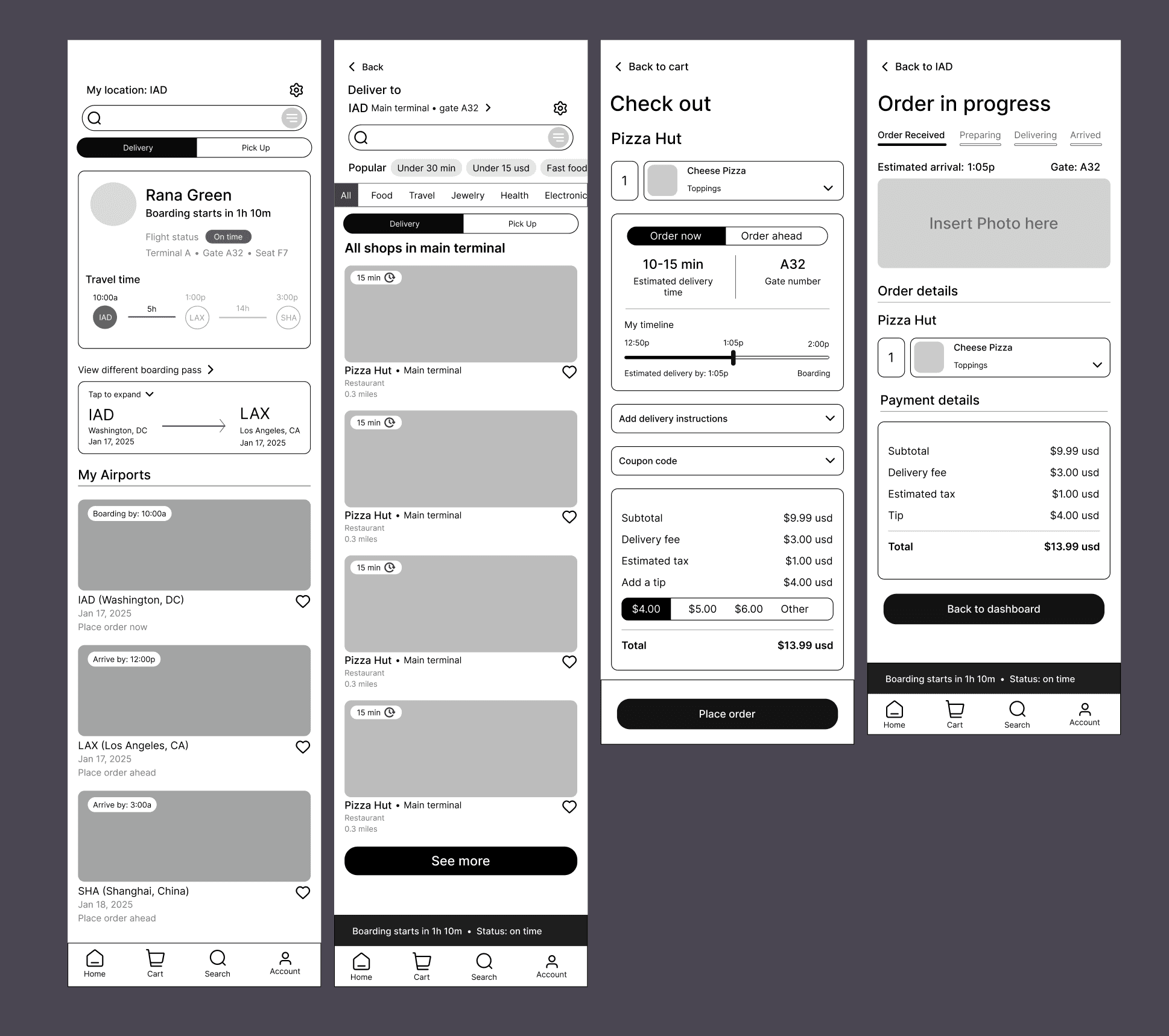
Final High Fidelity IAD: Order Food Part 1
Final High Fidelity IAD: Order Food Part 1
Final High Fidelity IAD: Order Food Part 1

Final High Fidelity IAD: Order Food Part 2

Final High Fidelity IAD: Order Food Part 2
Final High Fidelity IAD: Order Food Part 2
Hold Order Now Becomes A Wishlist
This flow was based off of the “Wishlist” feature flow where users don’t see a payment screen but they understand mental modal wise that they are adding an item onto a list instead.
Hold Order Now Becomes A Wishlist
This flow was based off of the “Wishlist” feature flow where users don’t see a payment screen but they understand mental modal wise that they are adding an item onto a list instead.
Hold Order Now Becomes A Wishlist
This flow was based off of the “Wishlist” feature flow where users don’t see a payment screen but they understand mental modal wise that they are adding an item onto a list instead.
The Task Flow Below Explains How This New Wishlist Feature Will Work
The Task Flow Below Explains How This New Wishlist Feature Will Work
The Task Flow Below Explains How This New Wishlist Feature Will Work
Here Is The New "Hold Order" In Action:
Here Is The New "Hold Order" In Action:

New Task Flow For "Hold Button" in the Order Ahead Flow
New Task Flow For "Hold Button" in the Order Ahead Flow
New Task Flow For "Hold Button" in the Order Ahead Flow
Here Is The New "Hold Order" In Action:
Here Is The New "Hold Order" In Action:
Final High Fidelity LAX: Order Food Part 1
Final High Fidelity LAX: Order Food Part 1
Final High Fidelity LAX: Order Food Part 1

Final High Fidelity LAX: Order Food Part 2
Final High Fidelity LAX: Order Food Part 2
Final High Fidelity LAX: Order Food Part 2
Next Steps & Reflection
Next Steps & Reflection
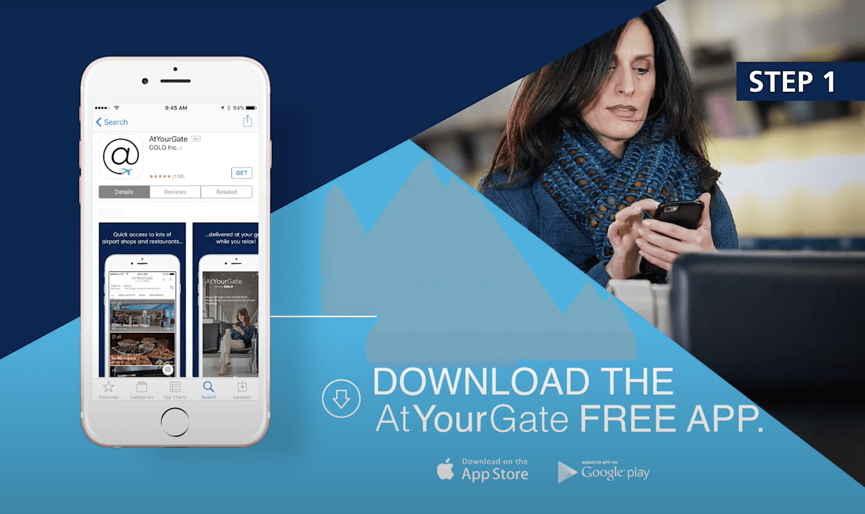
When I first started this project, it was challenge, as I had little real world examples to go off of, and the ones that did exist were mostly inaccessible in 2025. For example, I couldn't get AtYourGate to work so I based off my competitive analysis off of the few screen shots and videos I could find.
Aside from finding materials to refer to for my research, I was also wracking my brain over the "Order Ahead" user flow because between the mid and high fidelity tests, users were still confused by the "Hold Order" feature. That was until my last priority revision test where a user mentioned "Wish List" and I immediately went checked the flow for it and realized my current Order Ahead was very similar to it. From there, I took inspiration, and that was how I came to solve a hard problem that had been plaguing me for days. I'm truly thankful for the people who have worked with me to test this prototype, as these users have been the most important part of this project to guide me to where I am now.
For my next steps, I would once again do another interview and test session to help see if my current wish list is correct.
© 2025 Wei Yan
Email Contact
Socials
© 2025 Wei Yan
Email Contact
Socials
© 2025 Wei Yan