

User Interview
Summary
User interviews were conducted with questions relating to how people searched for local
events to find out the “why” of the situation.
At this stage, it was it critical we identified what the problem was before proceeding. We
had to give it a name and identity. Just what was plaguing our people?
Demographic Information
4 people between the ages
of 20-30 were interviewed.
Each session was an hour.
All participants held different
occupations.
User Interview Results
1
Person felt mislead by certain advertisements
for local events.
2
People cited social conflict as a contributing factor to anxiety.
2
People experienced an under current of social anxiety.
3
People want to find communities that share similar hobbies or interests.
4
Experienced lack of trust, causing individuals to only stay within their
own social circles, forgoing outside or unknown organizers.
Analysis
My findings show there were numerous problems plaguing people in their quest to
uncovering local events.
Individuals with social anxiety fear rejection from their local communities.
People don’t like building trust towards communities outside of their comfort zone,
as they often socialize only within their own circles.
People feel mislead by the solutions that do exist, such as false advertising.
Research
Summary
Research was conducted to narrow down the project's scope
4 people between the ages of 20-30were interviewed.
The results:
Data suggested a lack of trust in the current solutions provided.
Competitive analysis was done to analyze current solutions
which led to the creation of a mobile-first site due to the prevalence of mobile phones
today and the target demographic having the widest access to them.
Introduction
In the modern age, billion dollar corporations spend millions to catch our undivided
attention. When there is an advertisement for any big event out there, we often forget
about the smaller things. And in doing so, we dove into the reason why people missed
small events like these and asked questions:
How might we bridge this gap? Why was this happening only within our local
communities?
Personas
While the people I interviewed gave me key insights into their point of views,
not everyone had the same issues. To remedy this, two personas were created
based off of the main problems identified so I can hone in more critically on each
of their needs. Although they were fictional, their problems were more than real.
Competitive Analysis
Now with my problem identified, I looked to already present solutions to see
what they were doing with my personas as guides.
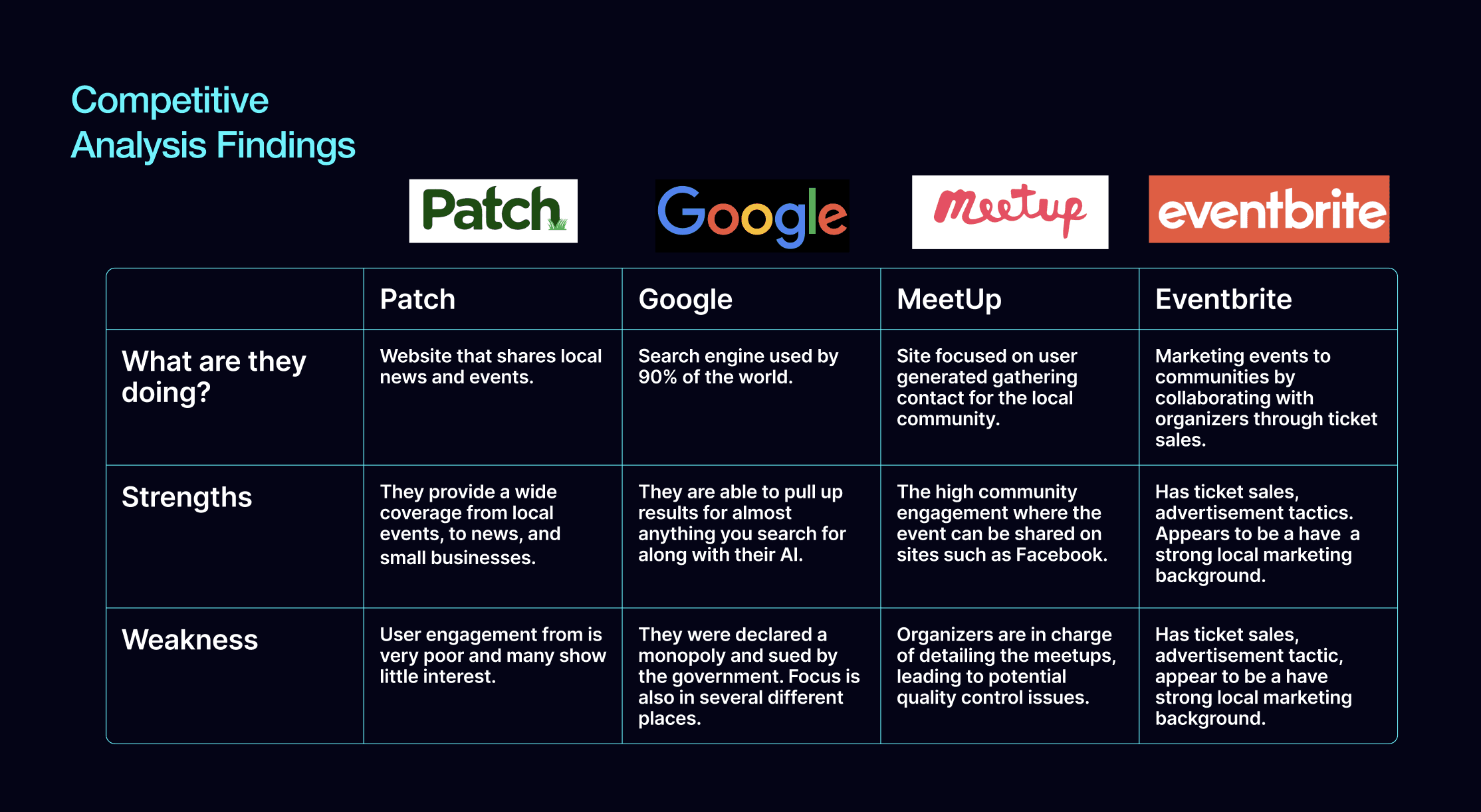
Analysis Results
Competitors take advantage of a niche need in the market for community or
small business hosted events because they have an audience willing to attend.
They are also taking advantage of being digital platforms because they have a
wider outright in today’s market.
Additionally, according to my research, mobile phone ownership has skyrocketed
since the 2016 and has become one the most common ways to access online content.
As a result, I propose my platform to also be a mobile first, web based platform
as it is the best medium to compete.
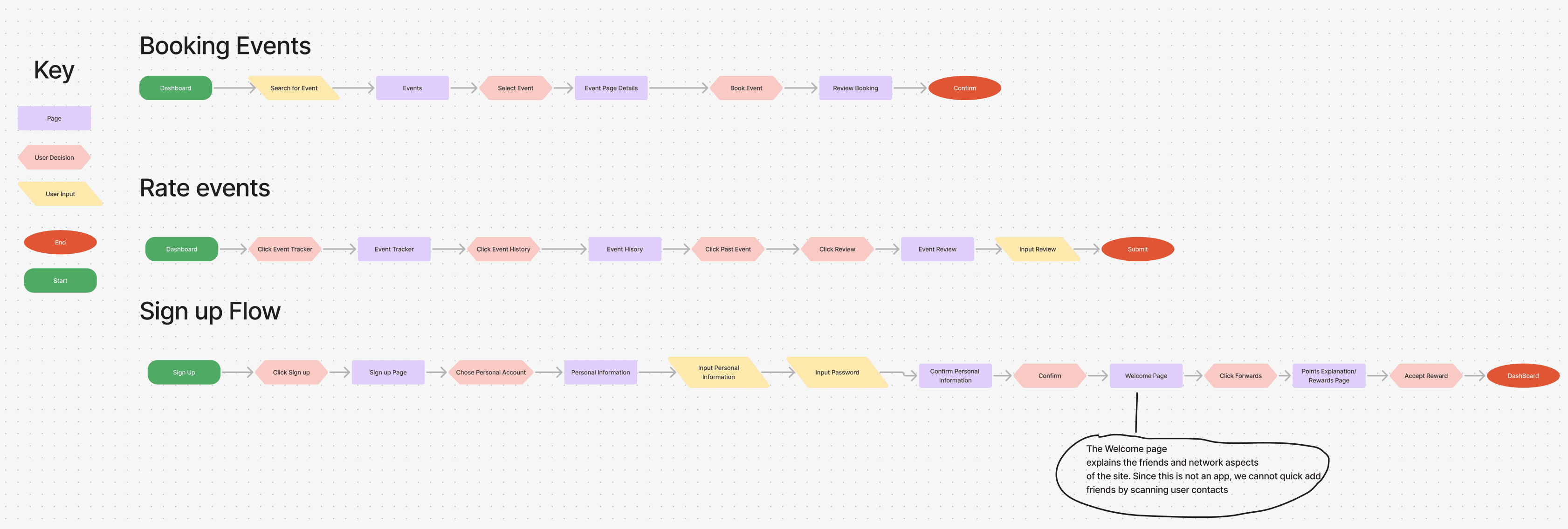
Information Architecture
Before I could start drawing up ideas for prototypes I had to figure out the needs
of my theoretical site. For example, what features would it have and which ones
would my users prioritize?
One again, I referred back to my personas and came out with three task flows I
wanted to build based on their needs. Aside from this, I had to develop an identity
for my site as well because I needed a mental representation people could flock to.

Wireframes
Low-Fidelity
Sketching out the task flow concepts, I tried to envision what the site would
be like. As seen here, there are multiple versions of the same page of which
were either combined in later stages or scrapped for better versions.
Mid-Fidelity
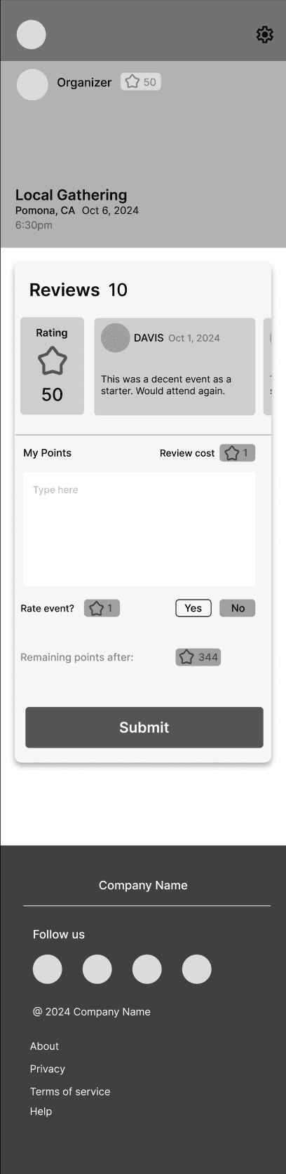
What I struggled with was defining the points system and how
it should work. I had to devise a solution where users understood
my rules that go as such:
Points are a limited resources for account holders on the site and
users would be able to spend these points to write reviews. The
limited points helps to prevent review spam. However, after I show
off this first design to my peers, many of them were confused
on what was going on.
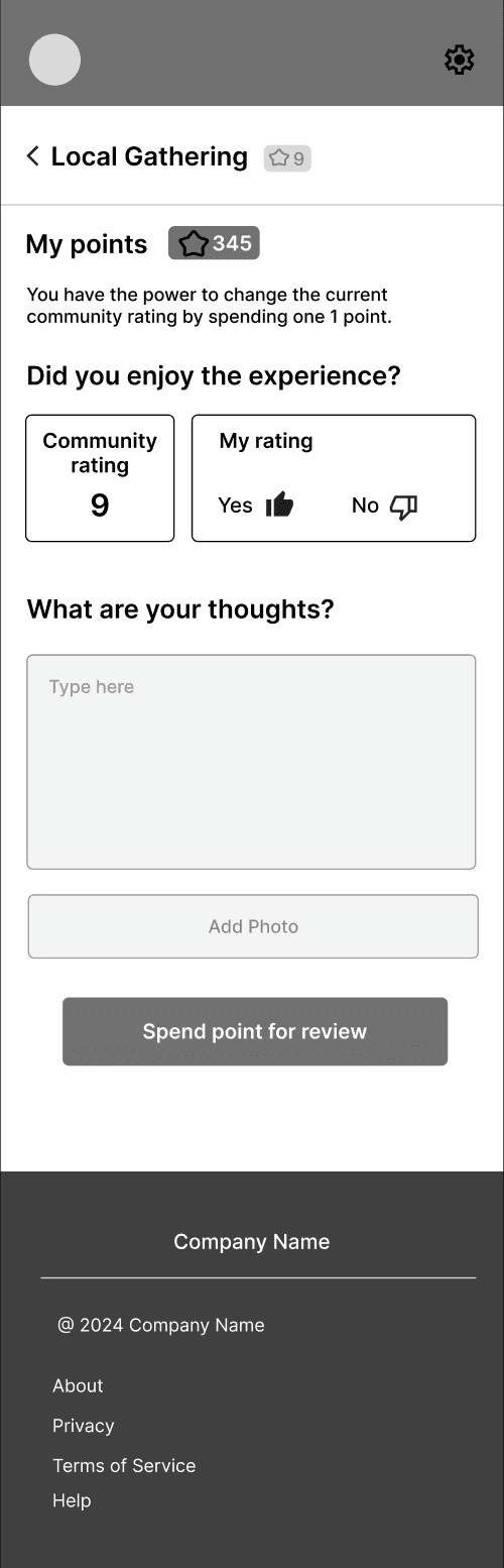
Going back to the drawing board, I simplified the design. Gone was
the posted review box which displayed other reviewers and I referred
to Yelp’s review system as a guide. The “yes” and “No” options to rate
an event were replaced by an up and down vote system similar to Reddit.
This fixed the complaint of other people’s reviews being distracting and
give my users a more familiar design pattern that was already established
in the wild.
High Fidelity Prototype
After being satisfied with my mid fidelity, I started my high fidelity version. My goal was
to flesh out my Points System feature once more, this time with color attached. I
assigned a striking orange to separate the “points” from the rest of the build so users
could associate it with that particular feature.
Usability Testing
Summary
I had users test my prototype and had them walk me through how they perform
three tasks, using their physical mobile devices for the full mobile experience.
I asked insightful questions along the way to what they thought of the experience.
Demographic Information
6 participants between 20-30 were
invited for testing.
Each session was an hour.
All participants held different
occupations.
Fixing the Points System
Fixing the Points System
Retooling the points system, bringing it in more alignment with user mental they will get
rewarded for reviewing to reduce less readability and gimmicks. Additionally, a leveling
system will be implemented where the more reviews a user writes, the point they receive
will level them up.
Points will no longer be a currency system but serve as experience points to level up a user
instead. This will still encourage trust among the community as event reviews will still be
locked behind an Event History wall and will encourage user reviews. System will be simplified
down to gaining points through adding friends, attending events, and writing reviews to earn
points with level rankings
being the primary goal.

Before

After
Other Fixes
Give the sign up page its own separate page with the ability to lead into the login page.

Before
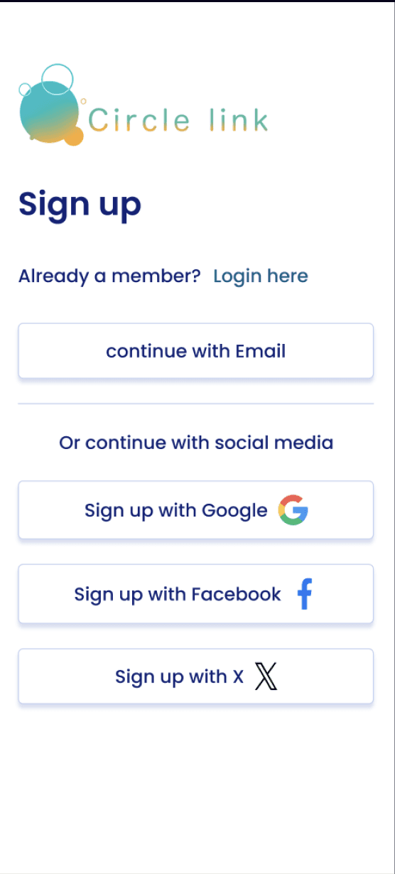
After
Two Factor
Have a phone number section along with two factor authentication to sign up, as well as
a message saying user info is security encrypted.

Navigation
Fully functional navigation hamburger menu with key function tabs will be used.
A attendance history tab as well as the “attend” button on profile have been linked
so users so more easily access the event reviews.
Event location details were added along with a button to view on Google Maps.
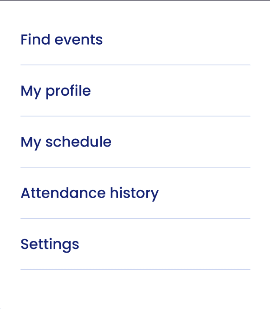
Menu
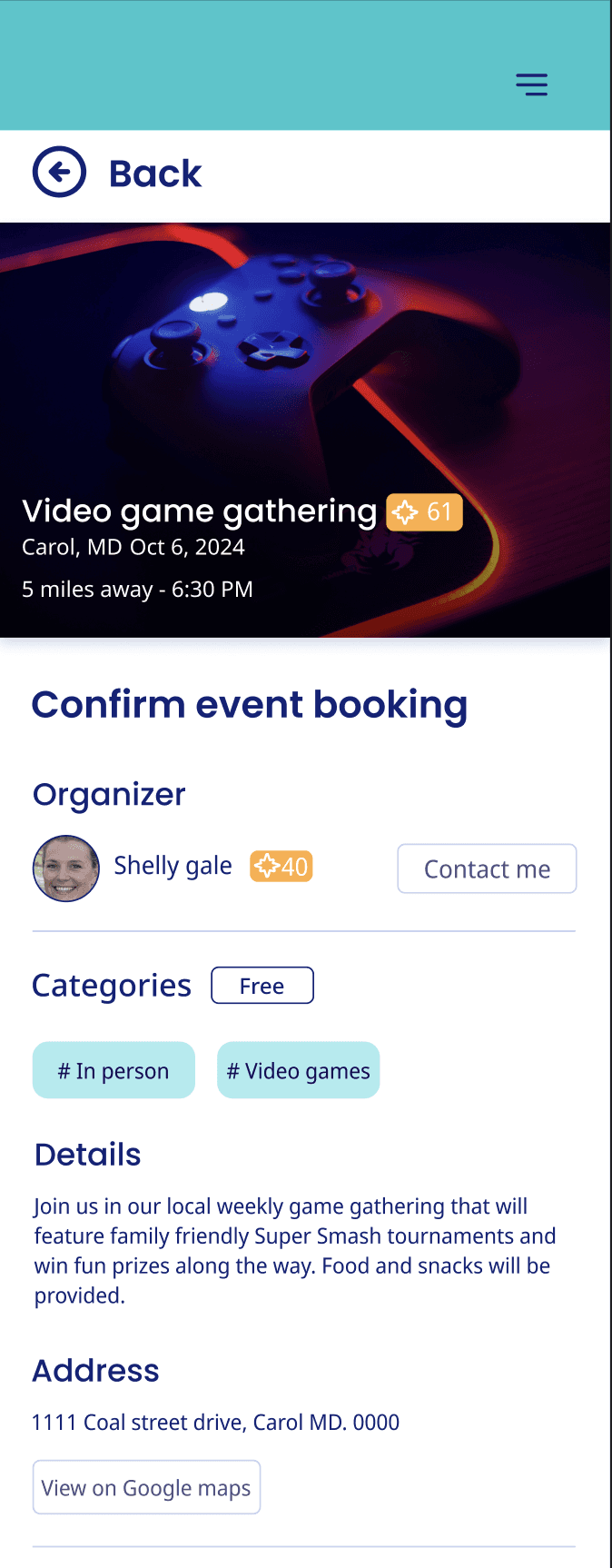
Google Maps Button
Conclusion
With the prototype tested, the journey of iteration would still continue, but at the moment I believe
this would be a solution for the people.
This project was a maze of twist and turns, especially designing a game system (Points) that
could mesh will with the site and help users understand my intentions. It was s struggle I have
to admit but I also felt rewarded coming to the solutions I have. The problem had several stages:
Devising the system
Explaining how it worked
Designing interfaces that worked alongside it.
Having users test and give feedback.
To deal with each stage, I had to think through my limitations. If I were to refine this even more,
I would do several more rounds of user testing to see if my fixes yielded better results and do
more research on gamification.
Circle Link
A mobile first site event site, exploring a
gamification system.
Role
UX/UI Designer
Tools
Figma
Photoshop
Date
Aug 23 - Nov 25 2024

Project Summary
Circle Link is a mobile-first project used to study the
implementation of a gamification system through the
lens of an event creation system. Originally focusing
helping users schedule local events in their area, the
project transformed when research data hi-lighted user
discourse over event attending altogether as they felt
little trust in organizers.
Gamification and Trust
To help my users feel at ease, I started to think how I could
help them build trust on my site. With the raise of spammers,
bots and scams on the raise I came up with a solution:
The Points System
This unique feature will allow users to hold a balance on the site where they
use on-site currency to post reviews. Users would spend a point to review,
preventing spam and each user is limited to how many reviews they can post
through their limited amount of points. Both events and organizers can
be rated by this system so it can reduce the problem of
being mislead as voiced in my interview data.
Points can be earned through attending events or adding friends.
Usability Testing Results
4
Users clicked the hamburger which was non functional at the time for navigation.
Menu for general navigation was supposed to be the profile icon.
2
Users were frustrated that the Sign Up lead them to the Login portal instead where
they had to scroll down to sign up.
2
Had security concerns for the lack of two factor authentication during sign up.
4
The points system still needed work as many users did not understand or breezed past
the explanation in the introduction. (They misinterpreted it as a rewards system where
writing a review would earn points instead of remove as intended.
4
users had trouble with navigating the site to post a review.